GOOD
- Illustrative
- Simple
- Clevel
- Clean
- Symetrical
- Minimal
- Sophisticated
- Interesting
- Crisp
- Textured
- Hand rendered
- Harmonised
- Organic
- Linear
BAD
- Blurry
- Cluttered
- Random
- Illegible
- Boring
- Grainy
- Colourful
- Dull
- Cheesy
- Inconsistent
- Silly
- Confusing
- Cheap
- Weird
- Garish
Aesthetics is a gut, immediate response. It's hard to create a set of rules because it's;
- Subjective
- Appreciate similar work but doesn't mean we'd create it
- Everyones idea of simple can be different
Everything influences and impacts our judgement;
- Clean, legible type
- Minimal, clean, crisp, fresh design
- Carefully selected colour scheme
- Thought
- Consistent design structure
Aesthetic judgement will improve the more we develop
We were asked to create three rules of aesthetics, mine were;
- Clean consistent structure
- Simple, minimalist use of colour
- Clean crisp design used in context
Clean consistent structure-

Even though the images are different for each print, the structure remains similar throughout, keeping that repeated pattern for most prints. By repeating a geometric shape pattern to create the structure it keeps the design clean and consistent.


The covers of Neue Grafik are famous for their simple, clean and consistent structure. Each cover followed the same grid system and looked near enough identical apart from the contents of the body copy, the margins within the grid ensures consistent spacing between text.
Simple, minimalist use of colour-

The use of the large turquoise rectangle just breaks up the page to make that bit less boring because without it would solely be the grey text as opposed to the white against the turquoise. I don't know if the colour represents anything or is relative to the book.

This features simple contrasting stroke that breaks up the mass amount of empty space. The neon orange against the off white texture paper works so well together especially with the greyscale image.

The designer uses colour this time round to create an image out of negative space is such a simple idea but looks a lot more detailed as opposed to just drawing out the chair.
Clean crisp design used in context-

The designer has used green triangles to create a visual representation of canada and the forests it is famous for.

The simple use of a white circle upon a black background to visually represent a moon for a movie called moon is definitely a simple concept used in context.

The use of 'C' to illustrate a condom being worn, this is a great simple visual representation that is totally unique and original.
Now that I have explored graphic design and put my aesthetic rules into action I will now apply these rules to other areas of design such as product and architecture.
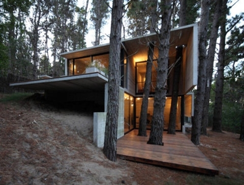
Architecture- clean consistent structure


Architecture


Clean crisp design used in context-