Homepage
Below are a series of screenshots of websites that could serve as inspiration for my Dieter Rams homepage. I have chosen sites that are simple in design but are well structured through the use of grids thus making them functional and ultimately relating back to Dieter Rams 10 good design principles. It'd be silly to ignore these principles, it's like creating a modernist publication in a post modernist style where the type is illegible and lacks complete structure.
The website below is very functional and easy to navigate, the grid structure is obvious in the design which makes it less confusing when you first see it, each individual section is separated meaning the information is easier to process.

Golden Cosmos
This a great example of an extremely minimal website done well through its use of the scroll down feature and simple navigation. As one enters the sites homepage straight away you're greeted with the first selection of work as opposed to the usual 'about me', this straight away engages the viewer. Golden Cosmos is a design studio so people going to their site will already know why they've gone there meaning we're greeted with their work which grabs attention. All of their work is based on a single infinite scroll page, so when you come up to a publication instead of clicking to look through it you just continue to scroll down which will flick through the pages.
The important information is all clearly displayed on the right hand side of the page and is never obstructed by image which just adds to the ease of navigation and functionality.

Grid
I have also gridded all the fixed features of the website to give me an idea of layout etc... The image and about the product scroll with the pages so the width, height and position varies depending on scroll and product.

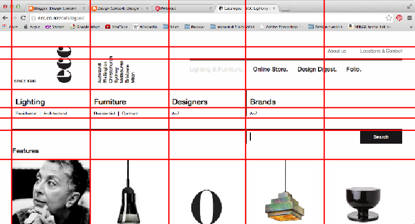
ECC lighting and furniture
This website was created by Sons & co in New Zealand for ECC and actually won awards for it which is no surprise. If the internet was around when Josef Muller-Brockman was in his prime this is exactly what would have been created, it screams Swiss modernism. This website is not only beautiful to look at, it is also just as functional.

The grid on this website is very obvious due to the way the images have been laid out and the separation bars have been used. Horizontally everything is equal distance which helps as you scroll down the page as it doesn't allow anything to detract from what is on offer product wise.
Nosive Strukture
Nosive Strukture's website was created by BP&O along with their entire rebrand. The website again is simple and easy to navigate which to me is the most important thing in websites because people unknown will be trying to find their way around it without any help, if I struggle to navigate a website I get frustrated and leave therefore this is a key feature in my website. Yes it could be too simple but my subject choice is Dieter Rams so to me I want it to be simple to reflect his design, just not boring.

The grid I've applied to this website is more like the one I would be likely to use based on my scamps and basic ideas I have in mind. Both left and right side bars are of equal width and the centre which would be my vectors is exactly double a single sidebar, making the whole thing a grid of four.

Sébastien Bertrand Gallery

