Carrying on from the discussion we ad as a class I have gone away to look at and quickly analyse a few websites.
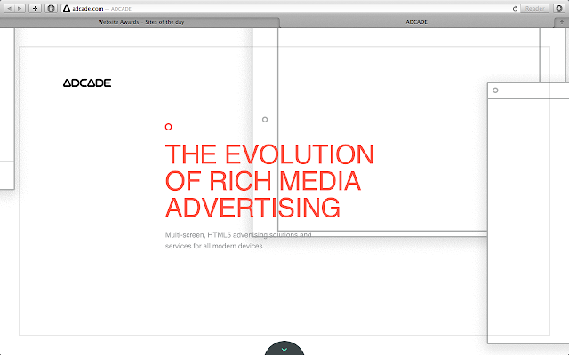
Adcade.com
'What is it?', minimal, confusing. After the first 5 seconds I wanted to leave the site but as you click the small arrow at the bottom a whole world of information appears as one scrolls down.KitKat
Bright, red, narrow, what next. After waiting a few seconds and being slightly confused, a scroll sign appeared which then enabled me to scroll through a visual path of information about kitkat. I don't understand the purpose or point of it, it's not a new model or recipe, it's nothing new, it just seems to be a bit of a novelty.
100 ans de tour
 Minimal, exciting, beautiful colour, simple, frustrating. I don't know whether it was just my computer or the website but it took a very long time to load which was quite off putting but once passed the initial home screen you come to a beautifully designed grid of the years. Hidden behind each one is a world of information waiting to be unearthed. This website is absolutely amazing and a must visit for any TDF fan. The purpose of it is to simply visually inform about the past routes, stages and much more.
Utter confusion, vast, information, exciting. I don't have a clue what this website is for or about, it has little information but I'm quite excited to zoom in and find out. After zooming in further and further I'm still confused, it proves to be an anticlimax. Seems to be just an online logbook or something, completely pointless and a waste of time.


