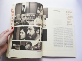
Below are a few examples of layouts that involve both type and image that I think could be useful in the development of my horse double page spread and influence my design sheets.
I love the simplicity of the spread above, it's so clean and fully utilises both pages by having the image spread across two pages. Even with the large white space in the bottom left corner it still doesn't look bare or like it is missing something because of the un uniform layout of the images and type. The saturated pictures accompanied with the off white stock adds to the spread.
The uniformity of the type and image laid out into a grid grid formation gives this simple layout more depth and makes it more interesting. The full page of of text works well on this document but i'm unsure if it'll be useful for my 500 page spread because I believe it'll only work with a lot more text.
I love the large space from the top of the page to the the main body copy and image, this could provide me with space to add a title and maybe a feature quote.
The 2 spreads above would be useful for me to produce a timeline because it is great to show images and lay out text chronologically because it's all laid up in a row with space below the images. It's an extremely simple but well laid out which allows easy readability and functionality.
This layout above utilises the imagery by spreading them across the 2 pages meaning full focus is on the images, I love the layout and the black and white imagery but I don't think it would be suitable for my spread because it wouldn't provide sufficient space for my body copy without it becoming too much and a mess.


