Archives

OUGD406 DESIGN PRACTICE- Indesign layout research

Below are a few examples of layouts that involve both type and image that I think could be useful in the development of my horse double page spread and influence my design sheets.


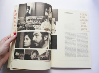
I love the simplicity of the spread above, it's so clean and fully utilises both pages by having the image spread across two pages. Even with the large white space in the bottom left corner it still doesn't look bare or like it is missing something because of the un uniform layout of the images and type. The saturated pictures accompanied with the off white stock adds to the spread.


The uniformity of the type and image laid out into a grid grid formation gives this simple layout more depth and makes it more interesting. The full page of of text works well on this document but i'm unsure if it'll be useful for my 500 page spread because I believe it'll only work with a lot more text.


I love the large space from the top of the page to the the main body copy and image, this could provide me with space to add a title and maybe a feature quote.


The 2 spreads above would be useful for me to produce a timeline because it is great to show images and lay out text chronologically because it's all laid up in a row with space below the images. It's an extremely simple but well laid out which allows easy readability and functionality.


This layout above utilises the imagery by spreading them across the 2 pages meaning full focus is on the images, I love the layout and the black and white imagery but I don't think it would be suitable for my spread because it wouldn't provide sufficient space for my body copy without it becoming too much and a mess.

OUGD406 DESIGN PRACTICE- Notebooks

Below is research I initially undertook to see what was already on the market what was being produced. I looked at more typographical designs because my initial ideas are to create something typographical based on the quotes I received from my peers about the course and their first year during my primary research.


Field notes have been my main inspiration for creating 3 different types of notebooks, it's selection of grid, plain or ruled is really handy and useful and I believe it would be extremely useful for next years students to have these available. Each type of paper has been useful for different briefs and sessions all year.


I like how they've used a lightbulb to represent ideas, this ties in with my idea of creating symbols that represent the area of design that each notebook is for. This also a similar method of production and use of materials which I want to use to create mine except I want to saddle stitch mine as opposed to staple bound.


I enjoy the way the gridded lines have a border as opposed to running straight off the page, however I believe this could be hard to replicate due to the fact the printer in the studio is extremely difficult to line up double sided, it's one of them things that if I don't pull it off it'll ruin the whole book and look terrible.


These books above relate to my quote idea, I was thinking about putting quotes about the course onto the front of the books to give the students a feel for for the course and what to expect.


I love the cleanness and simplicity of this diary, the different weighted lines provide the perfect hierarchy that I believe will be needed for my resource pages. The simplicity also helps in a notebook because you don't want it to be over complicating and detract from its function.

OUGD401 CONTEXT OF PRACTICE- A brief history of...

Typoography

One of the strongest characteristics of the Swiss style typography is the use of sans-serif typefaces such as Akzidenz Grotesk, Univers and Neue Haas Grotesk. The Swiss Style advocates that the typeface does not have to be expressive in itself, it must be an unobtrusive instrument of expression.

The Swiss utilised font size as tool for readability, impact and rhythm. Different font-sizes not only generate visual impact, but also provide readers with a hint about the hierarchy of the presented data. The larger words act as entry points for the eye, the is an extremely efficient method of guiding the readers eyes through the pages content.

Univers

In 1954 the French type foundry Deberny & Peignot wanted to add a multi weighted linear sans serif type to their portfolio of Lumitype fonts. Adrian Frutiger who at that time was the foundry's art director suggested they avoid adapting an existing typeface. Instead insisting they create a new font that would be more suited for typesetting longer texts. In 1957 they released a multi weighted font called Univers

Helvetica

In 1957 Helvetica was developed at the Haas foundry by Max Miedinger with Eduard Hofmann. Originally named Neue Haas Grotesk, Helevetica was created to compete with Akzidenz-Grotesk in the Swiss market. The aim of Helvetica was to create a neutral typeface that had great clarity, had no intrinsic meaning in its form and is versatile, enabling it to be used on a wide variety of signage. Neue Haas Grotesk was changed to Helvetica (Swiss in Latin) in 1960 

"Helvetica was a real step from the 19th century typeface... We were impressed by that because it was more neutral, and neutralism was a word that we loved. It should be neutral. It shouldn't have a meaning in itself. The meaning is in the content of the text and not in the typeface." Wim Crouwel


Akzidenz-Grotesk

Akzidenz-Grotesk was designed by Günter Gerhard Lange and issued by the H. Berthold AG type foundry in 1896. It was the first sans serif typeface to be widely used in design, was used as a model for creating Helvetica a whole 60 years later, and was a heavy influence in the creation of Univers and Folio.


OUGD401 CONTEXT OF PRACTICE- A brief history of

Swiss Design

Without Swiss Style of design, contemporary graphic design would be almost unrecognisable. The readability and cleanliness of the style as well as its asymmetric layouts, use of a grids and sans-serif typefaces have helped define how we design today. Designers today are still taking the best elements from this era of design to create a whole new contemporary, visual aesthetic.

Some of the major components of Swiss design include:
  • Sans serif typography (primarily Akzidenz Grotesk, Helvetica, and Univers)
  • Asymmetrical compositions
  • Flush left, ragged right text alignment
  • Mathematical grids, often on a tilted axis
  • Objective, black and white photography
  • Extreme geometric reduction of illustrated images
  • Bright, flat areas of colour
  • Universal symbols


Josef Muller-Brockmann

Josef Muller-Brockmann was 'established as the leading practitioner and theorist of the Swiss Style, which sought a universal graphic expression through a grid-based design purged of extraneous illustration and subjective feeling'. Born 1914 in Rapperswill, he studied architecture,design and history of art at both the University and Kunstgewerbeschule in Zurich. He was a pioneer in Swiss design, writing what most say is the definitive book on grid systems; 'Grid Systems in Graphic Design', being the co creator and editor of Neue Grafik. He produced many iconic pieces of design that to this day don't look dated and still set a benchmark for many of todays designers.

'Order was always wishful thinking for me. For 60 years I have produced disorder in files, correspondence and books. In my work, however, I have always aspired to a distinct arrangement of typographic and pictorial elements, the clear identification of priorities. The formal organisation of the surface by means of the grid, a knowledge of the rules that govern legibility (line length, word and letter spacing and so on) and the meaningful use of colour are among the tools a designer must master in order to complete his or her task in a rational and economic manner'

'The belief that graphic design if it was to inform and enlighten without being manipulative had to be based on objective criteria'

The solution was achieved through the use of symbolic language. The handling of the elements involved: type, shape, spatial relations, rhythmic proportions, and color functioned through a systematic employment of the grid

Armin Hofmann


Along with the more well known Muller-Brockmann, Bill and Ruder. Armin helped shape modernist graphic design beyond recognition. Hofmann was born 1920 in Winterthur, he studied at the School of arts and crafts in Zurich, upon graduation he worked as a lithographer. He went on to open in own studio in Basel later becoming a teacher at the Basel School of Arts and Crafts in 1947. 

He felt that one of the best and most efficient ways of communication was the poster and spent the majority of his career designing posters as well as writing a book outlining his practices and philosophies ; 'Graphic Design Manual'

Found in Hofmanns posters were new thechniques of photo-montage, phototypesetting, experimental composition and sans serif typography.

Quotes-

'I believe that one is more likely to develop a better perception of color by looking at the subtle harmonies of black-and-white images than by looking at the multi-and-overcolored illusions color photography often creates'

'Through the removal of colour, objects become neutralised and as interchangeable as letters of the alphabet. Above all, I am interested in the way an object changes in meaning when its context changes'


Emil Ruder

Born in Zurich, 1914. In his late twenties Ruder began attending the Zurich School of Arts and Crafts where the principles of Bauhaus and Tschichold’s 'New Typography' were taught, leaving an indelible impression on Ruder. 

Ruder was heavily influenced by Bauhaus graphic design, as he was a pupil of Johannes Itten while studying in Zürich, and believed typography should be functional.

Academia played a major role in Ruder’s life, though it would naturally evolve into the form of teacher rather than student. In 1947 he took a position as the typography instructor at the Basel School of Design

He broke away from the subjective, style-driven typography of the past and encouraged his students to be more concerned with precision, proportions and above all, the role of legibility and communication with type.

His work is peaceful, simple, fresh and highly imaginative. Stressing on legibility and reproducibility makes texts more readable and understandable.

After more than 20 years of teaching, he compiled his concepts, experiments and philosophies into a book titled, 'Typographie' Originally published in 1967, this masterpiece is considered by many to be the quintessential textbook on typography.

Quotes

'Typography has one plain duty before it and that is to convey information in writing. No argument or consideration can absolve typography from this duty. A printed work which cannot be read becomes a product without purpose'


Copyright 2010. All rights reserved.

RSS Feed. This blog is proudly powered by Blogger and uses Modern Clix, a theme by Rodrigo Galindez. Modern Clix blogger template by Introblogger.